

Skittles for the Soul

A couple weeks ago, the fabulous
wrote a post titled Only Boring People Get Bored. And it crystalized SO MUCH of what I’ve been feeling about fashion lately. The sameness, flatness and mundanity that we’ve been seeing as a result of social media and the proliferation of micro-trends galore. Bravo to Laurel for calling it all out in such an inspiring way!Since this post resonated so deeply for me, I’ve been analyzing my wardrobe to understand how I can break- and avoid- a general blah rut I feel from time to time, and ensure that my very own, unique personal style shines through more clearly.
The first place I’ve landed is COLOR.
Like many women of a certain age, I own a lot of clothes. Probably more than is prudent. No…definitely more than is prudent. And yes, I do a solid job of regularly culling, donating & selling, while being even more discriminatory about what enters my wardrobe. But when I zoomed out to take a bird’s eye view, I realized…I OWN A LOT OF COLOR. Yet like many others, I’ve fallen prey to the neutral Instagram grid of creams, beiges and blacks for the past year or so, neglecting the more vibrant side of my closet in the process. That’s like, almost half my clothes that I’ve been IGNORING! What a waste.
So I challenged myself to get back on the color wagon and re-integrate this aspect of my closet more intentionally, in ways that feel true to my personal style today. But I soon realized, it’s not enough to pair, say, a red sweater with black pants and call it a day. That too, felt a little flat. I wanted to personalize it further. That’s when I started playing with COLOR PAIRINGS. And it’s been funnnnnn.
Now, here’s an obvious segue to Tibi’s famous color wheel. (Which for the record, I totally use and love.) But in the spirit of Laurel’s post and my own realizations, I’ve decided- for the time being at least- to throw the color wheel away, and do whatever the f*ck I want instead. (I think I just heard some CP gasps….)
There’s something so liberating when you remove rules, guidelines or best practices from getting dressed. Sure, it can feel discombobulating - but that’s the ticket to fine-tuning personal style. The discomfort can lead to magic - which is exactly what I’ve been searching for. And I’ve a sneaking suspicion I’m not alone. I recently commented in
’s Substack chat, offering advice to someone seeking inspo for two harder-to-style pieces in her wardrobe: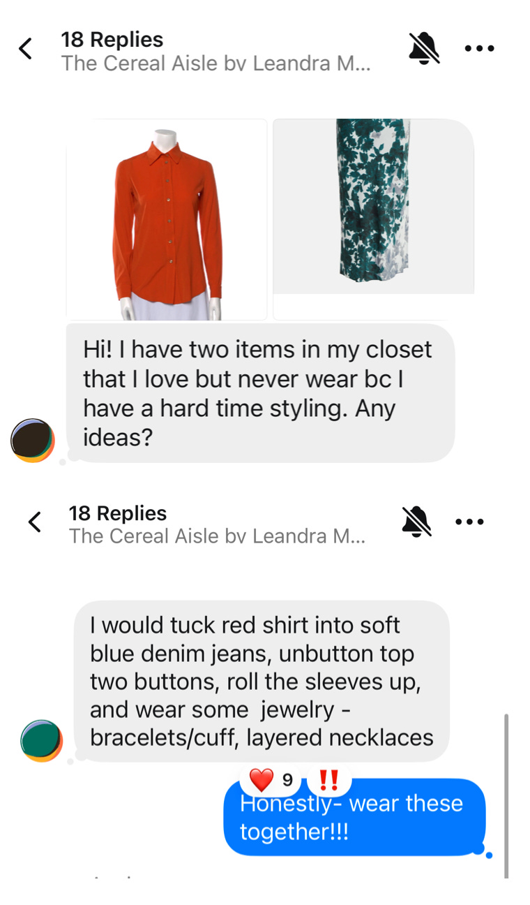
Look, I’m not tooting my own horn here (toot, toot?) but my comment received the most likes and engagement in that specific thread. (Not that 10 is a lot - lol - but you get my point.) People seemed to like the idea of wearing the vibrant red-orange blouse with the greenish-blue print skirt. Clearly I’m not the only one craving some pizzazz when it comes to how we wear- and pair- color.
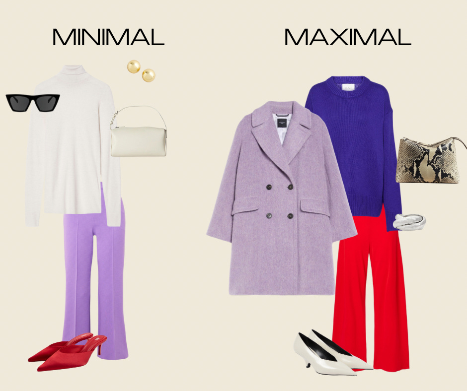
Now are any of my below color combos revolutionary? Probably not. But- it was revolutionary for me. And just maybe it could be for you, too. You’ll notice, because the color pairing was the ‘thing’ for me, I generally kept the silhouettes streamlined, avoided prints, and kept accessories minimal. This is because this approach best mirrors my personal style. It may not be the same for you! But maybe there are some new color pairings - or variations thereof- you may try that you otherwise may not have considered.
For each pairing, I’m sharing how I styled, along with more ideas on how to taste the rainbow, if you will. I’ve labeled these MINIMAL (just dipping your toe into the color pairing) and MAXIMAL (going full throttle).
So if you’ve been looking at a sea of beiges, blacks and creams in your closet and struggling to delineate one neutral sweater from the other, come along with me to the end of the rainbow!
Royal Purple and Bright Red
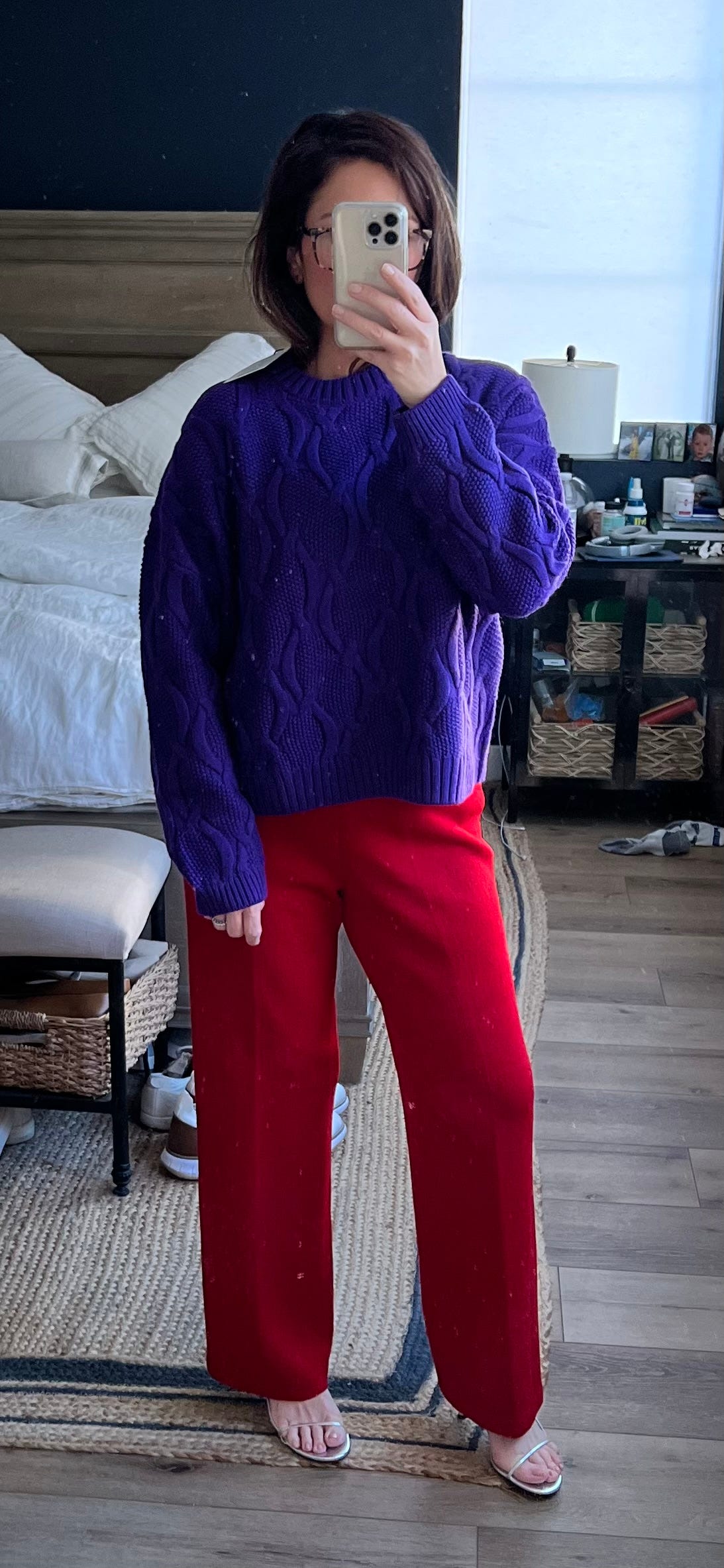
Let’s rip off the band-aid with the most intense pairing first! This look is all about BOLD and BOLDER. There’s something really ballsy about wearing two “wheel 4” colors together. It’s almost as if they cancel each other out, in some respect. By keeping the silhouettes and textures streamlined - both the sweater and pant are knits- it pulls focus to the color pairing. The barely-there silver sandal almost disappears, minimizing further distraction.
The cable knit on the sweater adds a hint of texture, which always helps. But ultimately it doesn’t matter, the color pairing does all the work here. These pants are part of my continued TRR obsession with vintage St. John - just so many staples at good prices. The sweater was a gift from M.M. LaFleur. They kindly reached out with the offer to try a few pieces. I’d heard of the brand but always relegated it to the “workwear staples” category. Yes, they offer functional, work-appropriate clothes, but I was very pleasantly surprised to discover they also design pieces with plenty of fashion edge, too! Use code SOGOLE20 for 20% off your first purchase.1
Some other ways to consider this daring color combo:
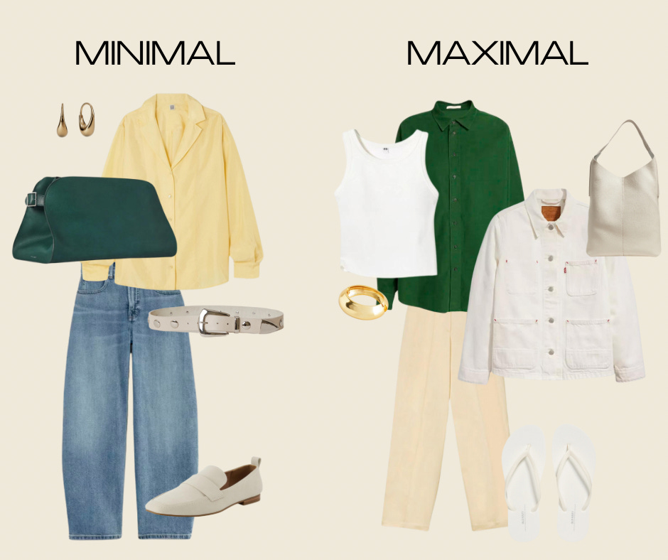
Hunter Green and Butter Yellow
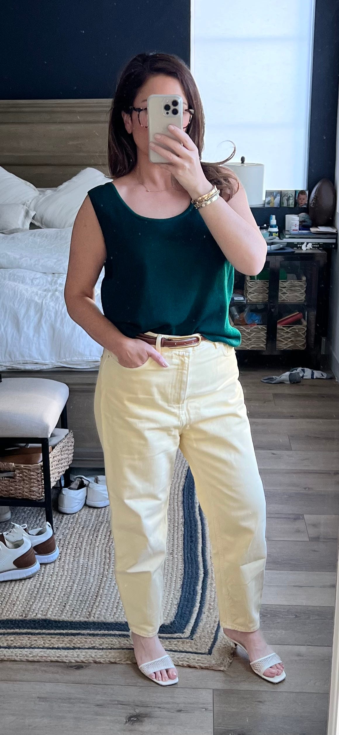
Here I challenged myself to take a color that’s been trending for spring/summer (butter yellow) and “autumn-ize” it. I always seek to extend the life of season-specific pieces in my wardrobe to make them work year-round. (In fact, check out
’s stellar post on how to wear springtime pastels in the fall for even more inspo!)Back to the color pairing at hand. I adore green, and hunter green in particular always does the trick for me (esp in the fall) thanks to its richness. I also love these yellow Toteme jeans but felt I had such a limited window I could wear them. Summer in SoCal is too hot for jeans, and in theory pastel yellow rings ‘springtime’ - so that would leave me with all of March, April and half of May to wear. Not anymore! By mixing with hunter green (eh hem, another TRR vintage St. John find here), I have so many more styling opps as we head into cooler temps! Threw on a brown belt for contrast and cream sandals since it’s still quite temperate here.
Fun note! Tod’s just showed this exact color combo (Look 12) on their runway yesterday…! More ideas on how to wear:
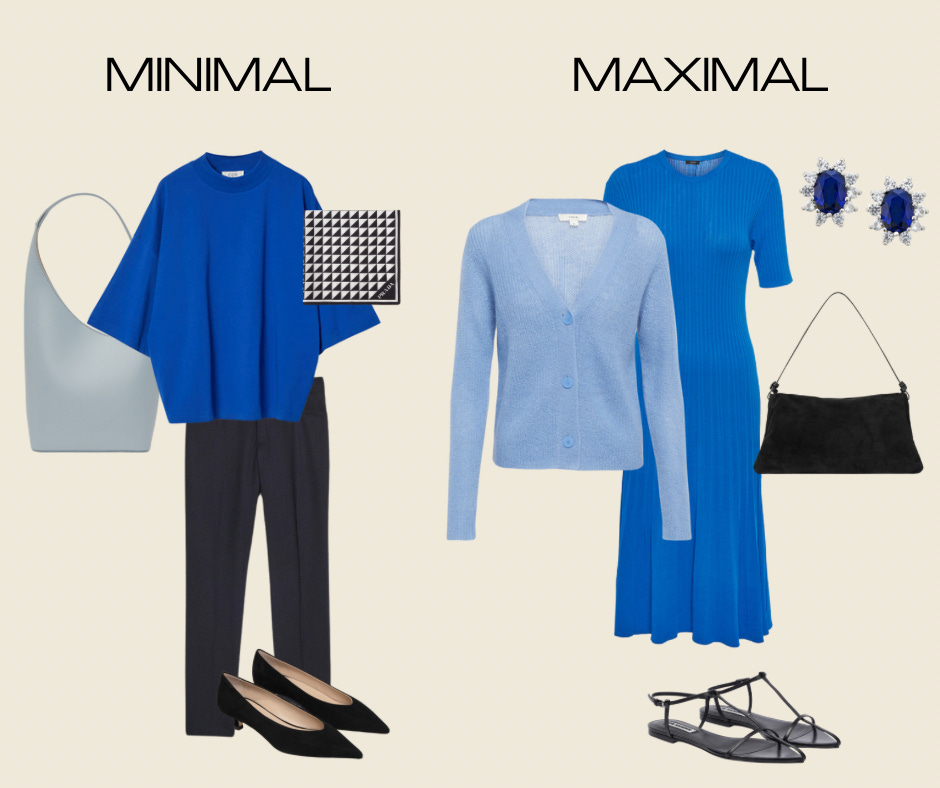
Cobalt Blue and Ice Blue
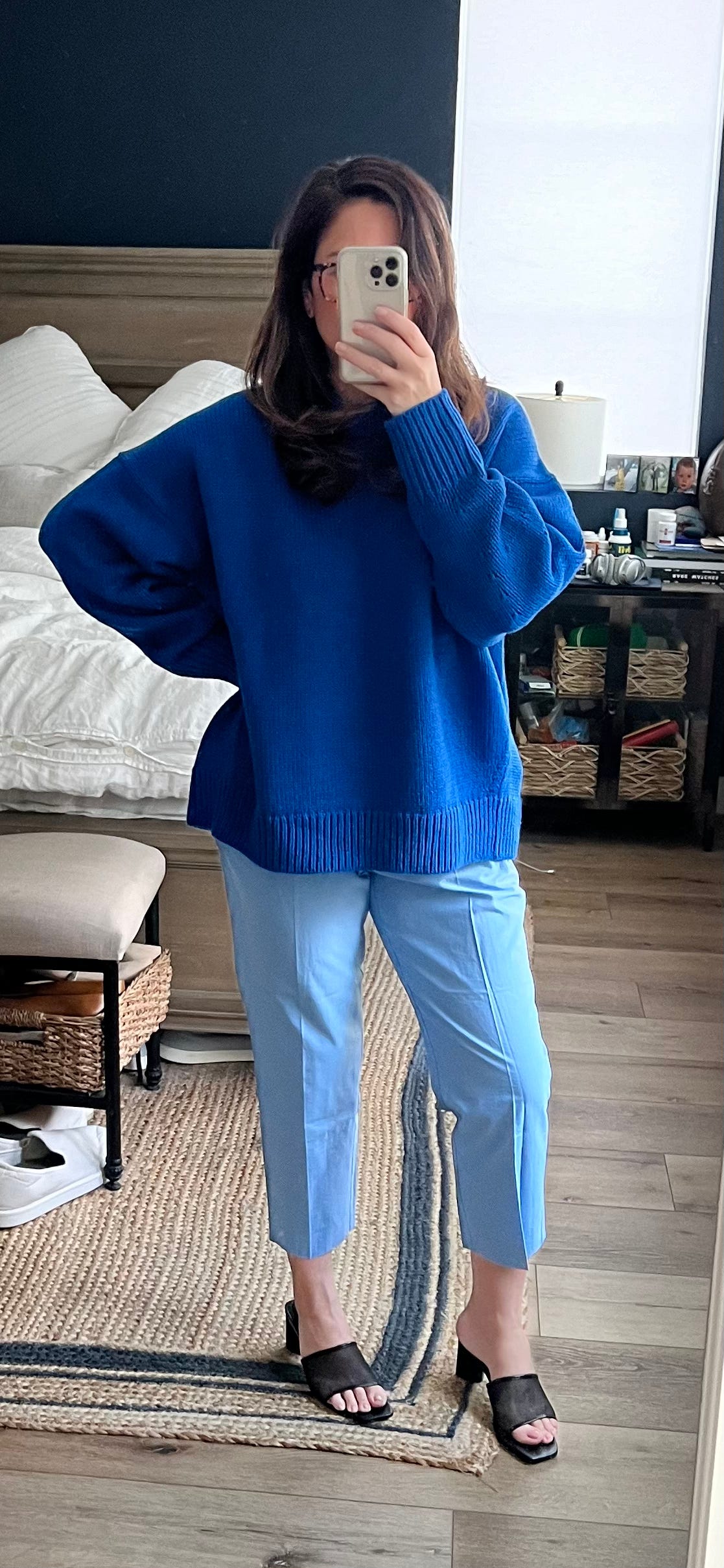
Ok, time for a tonal moment….because not every color pairing needs to be wild! I love tonal dressing, but it especially works with blue. It’s lends itself very well to pairing the full color range: ice blue to periwinkle to royal blue to navy- not to mention denim! It all works.
Sorry for another oversized sweater + pant combo but when a look works, it works. Sometimes it’s too exhausting to reinvent the wheel. When you find pieces and silhouettes that work for your personal style, body type and lifestyle; rinse and repeat! I am obsessed with this COS sweater - the shape, weight and fabrication are top notch. The pants are old Zara, but even a super light blue / faded denim would look fab here. I grounded it with a black shoe, to create contrast.
Some other ways to color drench with blue:
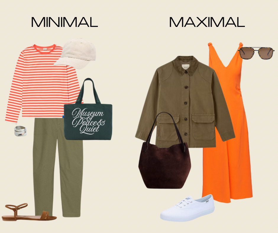
Carrot Orange and Army Green
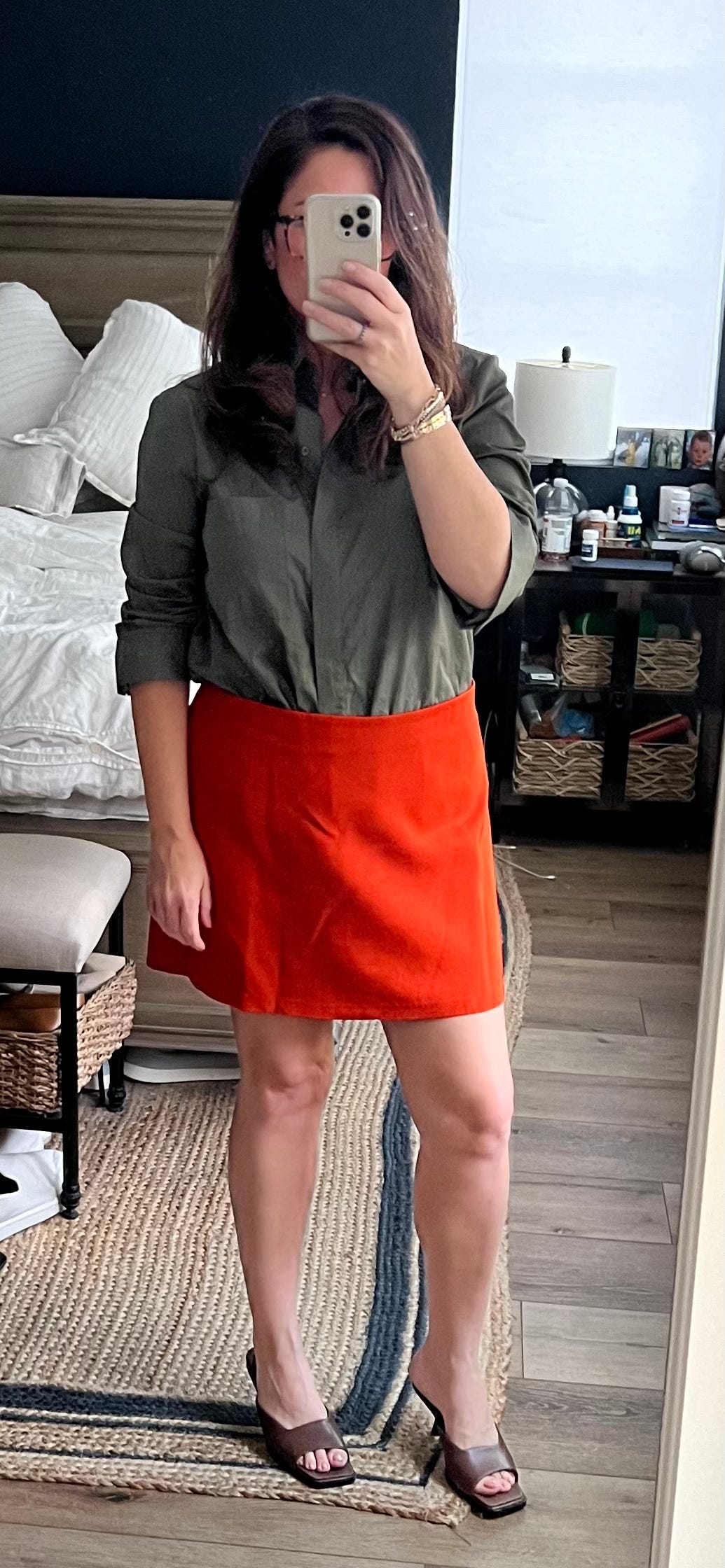
Well here’s a fun twist! Sometimes the best color combos are found in nature. I was at the farmer’s market a couple weekends ago and became enamored by these cutie organic carrots with the fronds still in tact. It made me realize green & orange look inherently good together bc well, Mother Nature says so!
I decided to dress my look up a bit, mainly bc I love this orange skirt and always look for an excuse to wear. But I find the “earthiness” of this look (esp when drawing such literal carrot inspo) is best translated when it feels exactly that- down to earth and casual.
Here are some fun off duty takes on this crunchy color combo!
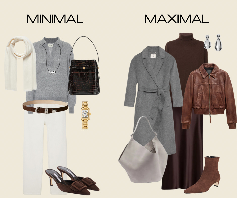
Shades of Gray and Brown
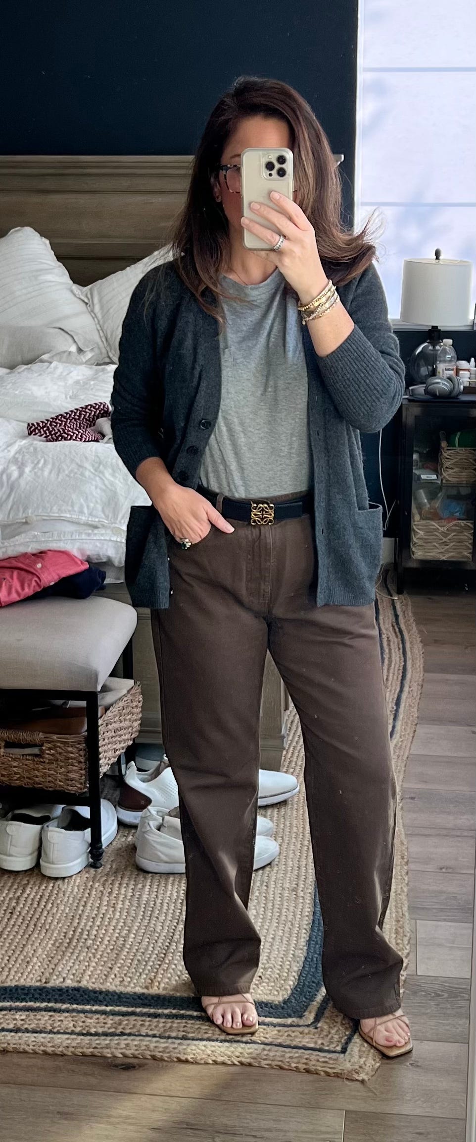
In my heart of hearts, I really do love neutrals. But they’ve been feeling blah to me, as mentioned. I wanted to put a new spin on how I style these wardrobe workhorses. I started with my jewelry, of all places. My perma-bracelet stack has a mix of both white and yellow gold, and feels very “me.” So when I started to contemplate how to apply such a signature element of my personal style to dressing, a light bulb went off: Translate the tones of my jewelry into clothing: pair gray (cool tone, silver) with brown (warm tone, gold)!
Again is this revolutionary, maybe not. But, I tend to pair my cools together and my warms together, so this was a fun way to break that mold and try a newer combo. I adore these Nili Lotan brown jeans and wear them a ton in the fall, but usually with cream or tonal brown sweaters. (Maybe black if I’m feeling moody.) A gray top is not my go-to pairing, but I think now it will be bc how good is this contrast?! I threw on a charcoal cardi along with tonal brown sandals for contrast, and finally a black belt to contrast. I love how rich this turned out- the color pairing does the layering work for you thanks to the friction it creates.
Some other ways to mix gray and brown:
If you found this post handy, there are a few other fabulous Substacks on color and color pairings to check out with tons more insights and ideas:
- Trend forecast: color stories- reds, chocolate and greens - How to wear fall’s hero colors - Non-colour colours inspired by S/S 2024 Runways (an older post but still so relevant and one I refer to often!)And of course Julia’s mentioned up top!
Do you have any others to share? Or any fun color combos you’re loving? Drop them in the comments, please! (Bonus points if you have pics!) Thank you for reading and for being here. Until next week xx
I use affiliate links where applicable throughout my posts, so I may receive a small commission from things you buy (but at no cost to you!) Thank you for supporting me in this little way so I can keep writing every week!
MM LaFleur discount code can’t be combined with any other offer and only available on full-price styles.
The orange and army green ❤️❤️❤️. Wow, thanks for adding more ways to play with your existing wardrobe without buying anything new. All the looks are stunning
Purple has always been my favorite color and I love wearing red. Seeing those two together made me squeal! Would love anyone's recs for a purple sweater that's a little more affordable. Also, those lilac High Sport pants are killllling me. Need to keep my eyes peeled for those on resale! This was a good one, Sogole